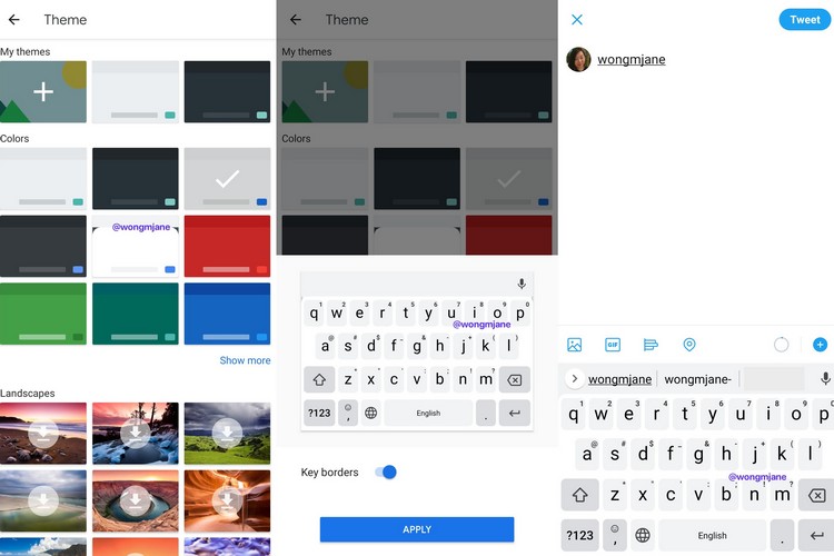
Since the inception of Gboard back in 2016, Google has made a number of changes to its keyboard app to make it more efficient. Now, recent findings suggest that Google is working to make Gboard much more minimalistic for users.
After the whole “Google logo on space bar” fiasco, the company is now looking forward to making up for that. According to findings by the app reverse-engineering expert, Jane Manchun Wong, Google might be working to give the Gboard a flatter and minimal look in the future.
Jane is basically a kind of hacker who reverse-engineers apps to dig up new features and security vulnerabilities. In a recent tweet, she shared some pictures showcasing the new look of the Google-made keyboard app.
Gboard is working on a new theme that looks flatter and more minimalist pic.twitter.com/PabxJKdR1a
— Jane Manchun Wong (@wongmjane) April 15, 2020
Now, at first glance, it might look similar to the current version of the Gboard. However, if you look closely, you’ll notice that the buttons are much flatter than the current buttons in the keyboard. Apart from this, it appears that Google made the toolbar above the keyboard much more compact and there is also an option in settings to turn off the key borders. When all of these changes come together, a user will get a much more minimalistic design of the Gboard.
Now, apart from the images, there is no information on a release date. We don’t even know if this design will be coming to the keyboard or not. So, If I were you, I will take this information with a grain salt, as of now.
from Beebom https://ift.tt/2yMRLCn

0 comments:
Post a Comment