When it comes to e-paper devices, the Kindle is of course the first brand people think of, though I’ve done my best to spread the Kobo and reMarkable gospel as well. Chinese e-reader maker Boox is a relatively new entrant to the space, and its devices are experimental but useful options in the niche market of monochrome tablets. In fact, they make my new favorite small device.
A brand from parent company Onyx, Boox has a wide array of devices, some might say too wide, ranging from pocketable to medium-sized e-readers to A4-sized tablets. Its branding is not particularly memorable and slightly updated versions come out quite regularly — one device I hoped to test was actually being replaced by the time I got around to writing this article.
The unifying aspect is the OS, a modified version of Android 10 with a few special-made apps for reading and productivity. Made with Chinese consumers in mind, the services probably aren’t ones you will have heard of.
I tested several devices from Boox, the simplest being the Poke 3 e-reader, then the larger and more complex Note2, followed by the svelte Note Air and enormous Max Lumi. Most recently I have been looking at the Nova3 Color, which uses E Ink’s latest Kaleido Plus color screen.
The truth is if you didn’t turn them on you probably wouldn’t be able to tell that these devices were all from the same company. They have quite different hardware styles, though of course there’s only so much room for expression in a black tablet with a screen in shades of grey.
Little and big
Let’s begin with the simplest and most familiar format, the 6-inch e-reader. In this category we have the Kindle Paperwhite and Kobo Clara HD. The former is probably the best one Amazon makes, but I prefer the latter, even though its build quality is, frankly, poor.
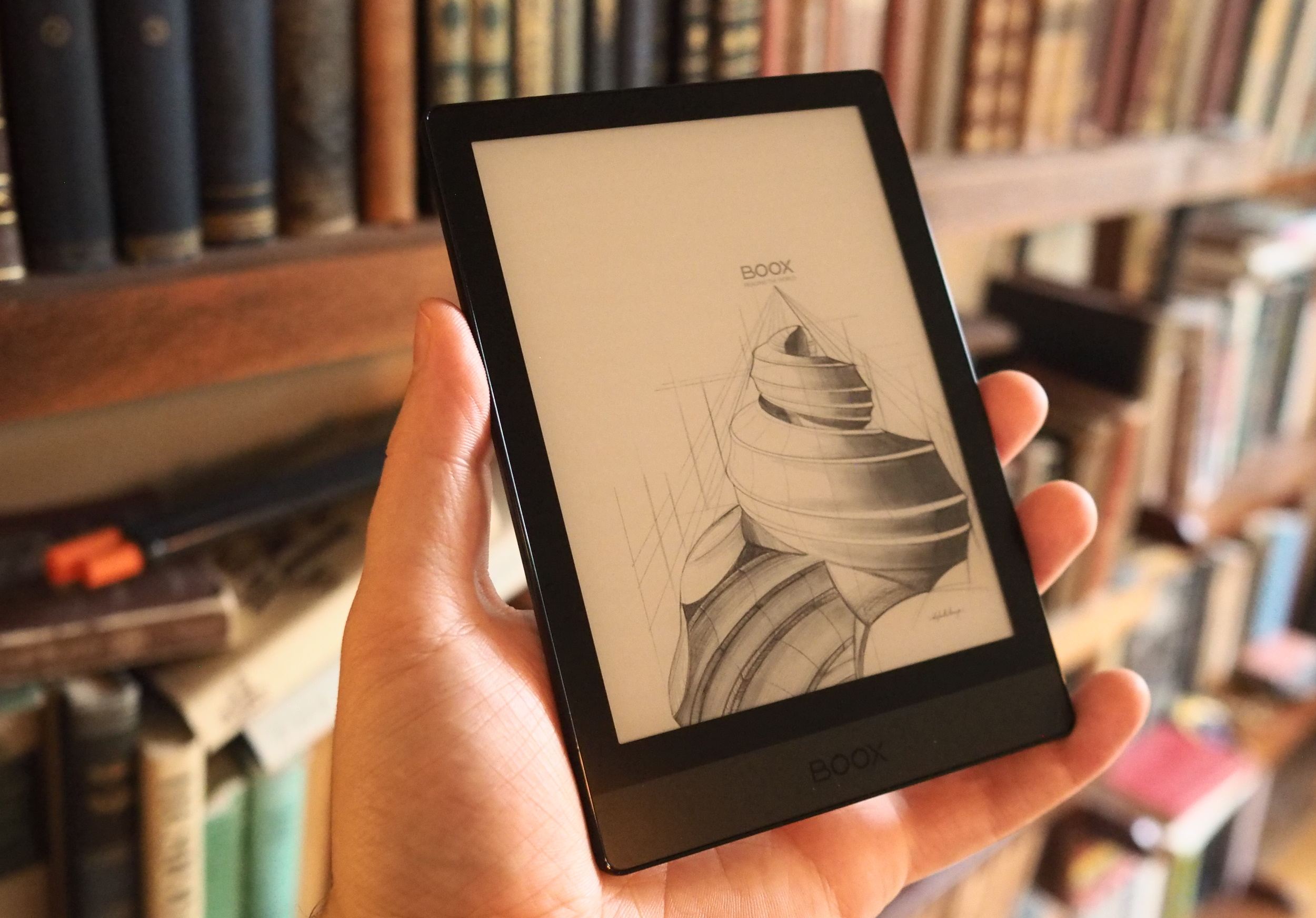
Boox in this space has (among others) the Poke 3, not exactly the catchiest name, but it makes up for that with its form factor: pretty much the platonic ideal for a small reader like this. I liked it so much I broke it out into a separate review, but here are the basics.
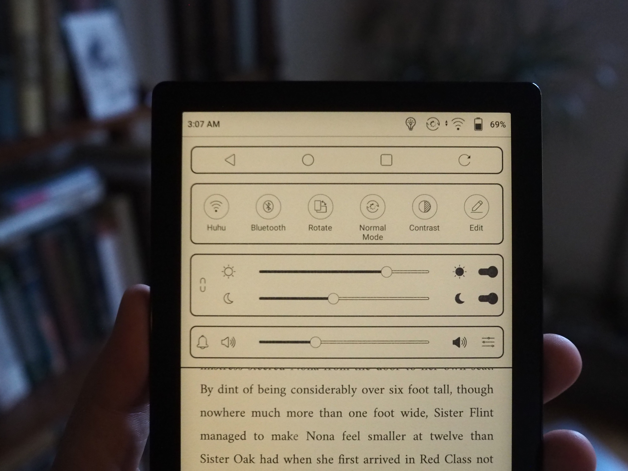
The 6-inch, 300-PPI screen is of equal quality to the Kindle and Kobo, and like the Clara HD has a temperature-adjustable frontlight. The front of the device is completely flush, just the way I like it, and has just enough bezel to grip without it becoming too much or too little. The seamless design makes it pocketable and resistant to crumbs and spills (though it makes no water resistance claims). There’s a power button up top (thank you) and a single USB-C port at the bottom.
Regarding the hardware I find it difficult to come up with any criticism at all. It could, I suppose, be lighter, but its dimensions could not be smaller than they are without adversely affecting the ergonomics; a millimeter could conceivably be shaved off the thickness but it would be barely noticeable.
The OS is a highly customized version of Android, with all the pros and cons that comes with. I have always enjoyed the simplicity of Kobo’s interface, though they seem bent on complicating it. Boox’s OS is powerful but busy, uneasy in its decisions of what options to make available and prominent to the user.
The reader app, NeoReader, supports tons of file formats and has a huge set of controls for changing your view, highlighting and notating books and PDFs, and so on. This is more more the larger devices than the small ones, which really only need font adjustment and other basic stuff.
If all you want to do is read e-books you already have sitting on your computer, it’s as easy as dragging them into the “Books” folder on the device’s storage. That tab is what you’ll see when you turn on the device, and it’s always easy to get to. There’s a built-in store that takes up a whole tab, though it isn’t available in the U.S. — then a file manager tab for rooting around in directories — and a tab each for your apps and settings.
The apps are another custom situation: This being a Chinese device, it comes without the usual Google-authenticated App Store, whatever it’s called these days. Instead, it has its own store with dozens of the most-used reading apps, from Pocket and GoodReader to the Kobo and Kindle apps. But these are essentially side-loaded: for instance, the Kindle app is a few months old. That’s far from a disaster, but you do need to commit to a certain amount of trust in Boox and its proxy app store in order to use the device as-is.
Of course, you can also enable Google Play services in the settings, which adds the official store into the mix. But for most people this is already far too much work. We are both spoiled and deprived in our e-reader selection in that they are generally simple and extremely straightforward to use. Someone who is not familiar with Android, using this device and a Kobo or Kindle, would probably opt for one of the latter.
Yet the possibilities are many for those who wish to take the plunge. For my part, I like the form factor of the Poke3 so well that I will brave any OS to use it. Besides, you spend 99 percent of your time on these things in a book, so as long as that part works the rest is just icing on the cake.
At the 6-inch scale, this all seems like way too much. But on Boox’s larger devices, the flexibility starts to make more sense. The idea with the Note 2 (now 3), Note Air and Max Lumi is to provide almost all the capabilities of an Android tablet, but with the benefits of an e-paper screen. Admittedly that makes playing racing games something of a non-starter, but it could be very attractive to the types of people for whom their reMarkable is used more than their iPad.
If you read a lot of documents, doing so on a bright tablet screen — or a dim one, for that matter — sucks. An e-paper screen is better for the task, but the best device for that, the reMarkable, is also very deliberately limited in what it can accomplish, since the whole philosophy of the company revolves around focus. So there are definitely people who want the capabilities of an Android device with the readability of an e-paper one. Or at any rate Boox thinks so.
The Note 2 and Max Lumi seem related: They’re unremarkable black tablets of impressive dimensions and, in my limited explorations of their hardware, what seemed to me excellent build quality. The Note Air, it must be said, is the opposite of unremarkable — in fact, when I saw it, I thought it was a clone of the reMarkable 2!
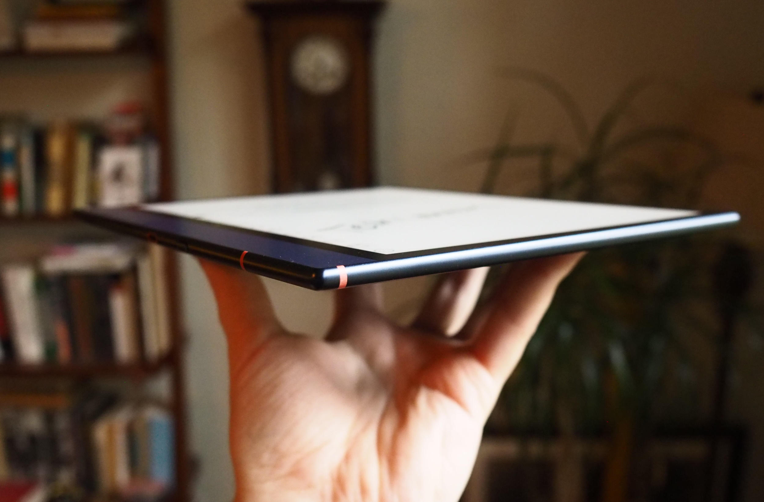
This first impression turned out to be less than generous on my part, as while the two share some significant design elements, they are in fact quite different and Boox’s facility in creating other devices has led me to give them the benefit of the doubt here. The blue and orange motif isn’t the greatest, but it does help set it apart, and all the devices (especially the Air) are thin and well designed.
All the tablets feature frontlights, and I’m happy to say that my skepticism that it could be done with such big screens was needless. It works well and like the Poke 3 the light is adjustable in both brightness and temperature (though it’s a bit fiddly).
Color e-paper still isn’t quite there
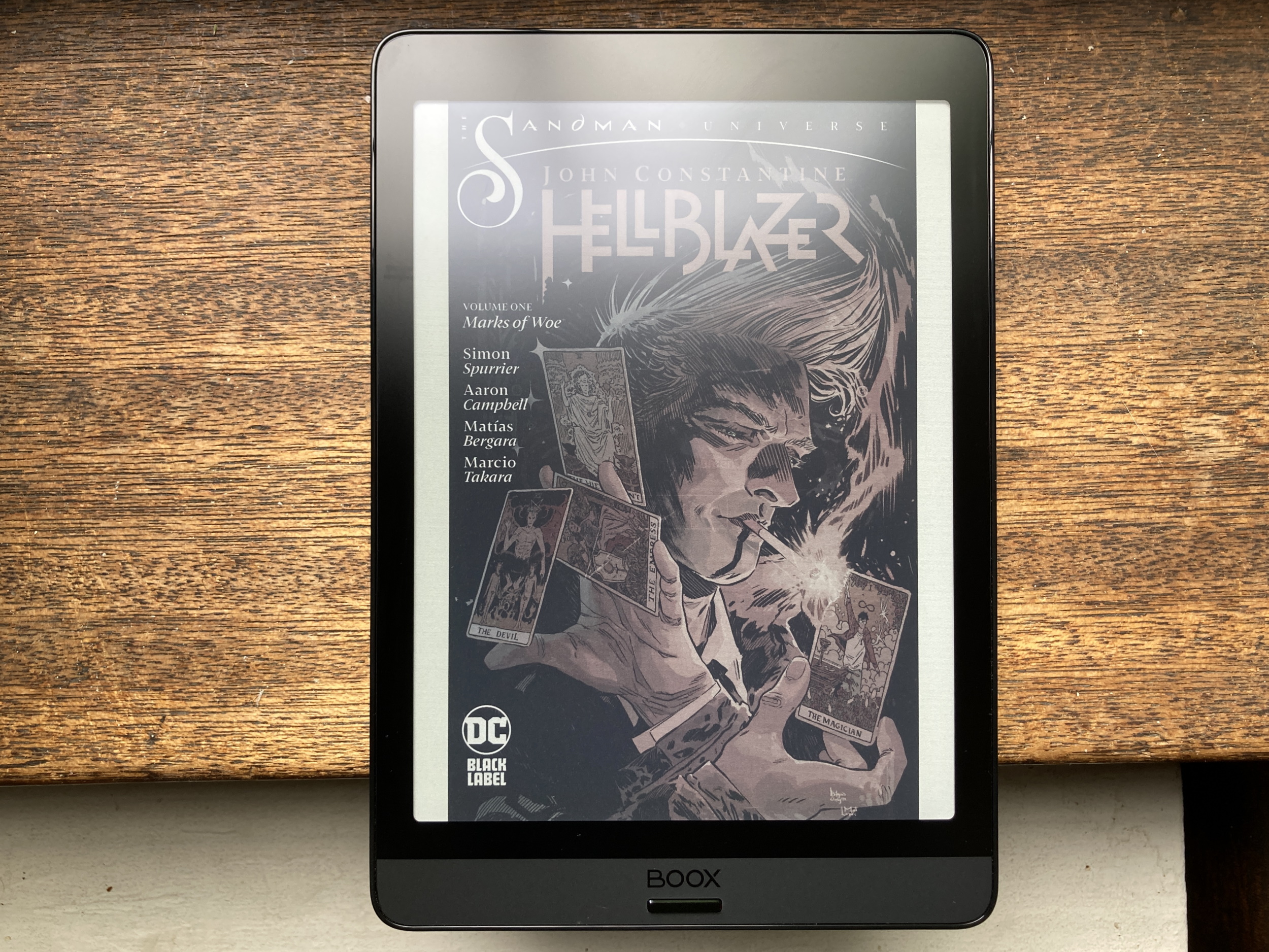
The Nova3 Color has a 7.8-inch screen with the latest color e-paper tech from E Ink. I’ve always been excited for the possibilities of this side of the technology, but color e-paper screens have always suffered from poor contrast, low refresh speeds, ghosting, and other shortcomings. While this latest iteration does go some way towards amending those (and a software update helped further), it is still unfortunately too much of a compromise.
The hardware is similar to the other Boox devices, solid and unassuming. The difference is all in the screen, which shows in color even when the device is off. Color e-paper works by combining the microscopic black and white beads that form images with a layer of color filters that can be changed. This one, like the others, has a frontlight and it helps a lot with making those colors pop, since without it they’re all rather muted.
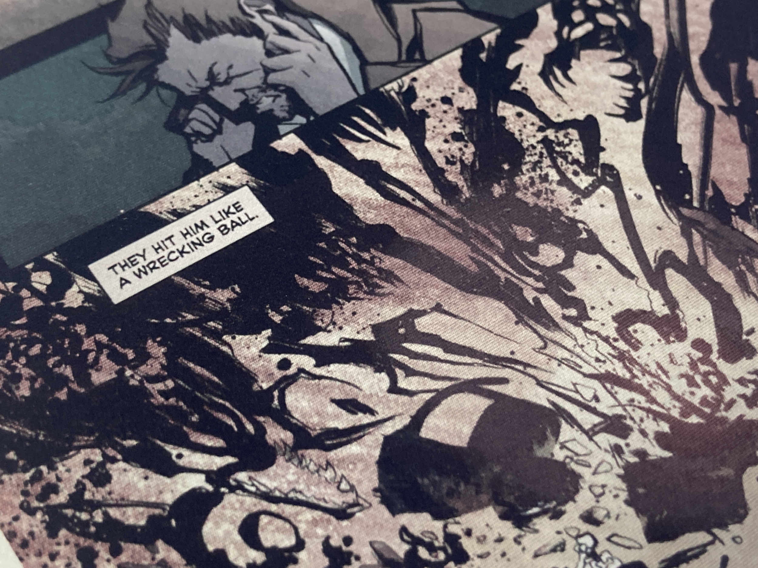
There is still the issue of ghosting, though if you’re reading, say, a comic, you can easily set it to refresh every page (it takes only a fraction of a second) and the problem is gone. It’s less easy to do this with more dynamic content like a webpage, though of course navigating the web on an e-reader is already something of a novelty.
More troubling to me is the decrease in contrast and effective decrease in resolution that the color layer brings. When color content is shown, there’s a distinct screen door effect to it, no quite like ordinary LCD aliasing but still visible. And when you have greyscale content you sometimes see moire and other interference patterns in mid-tones.
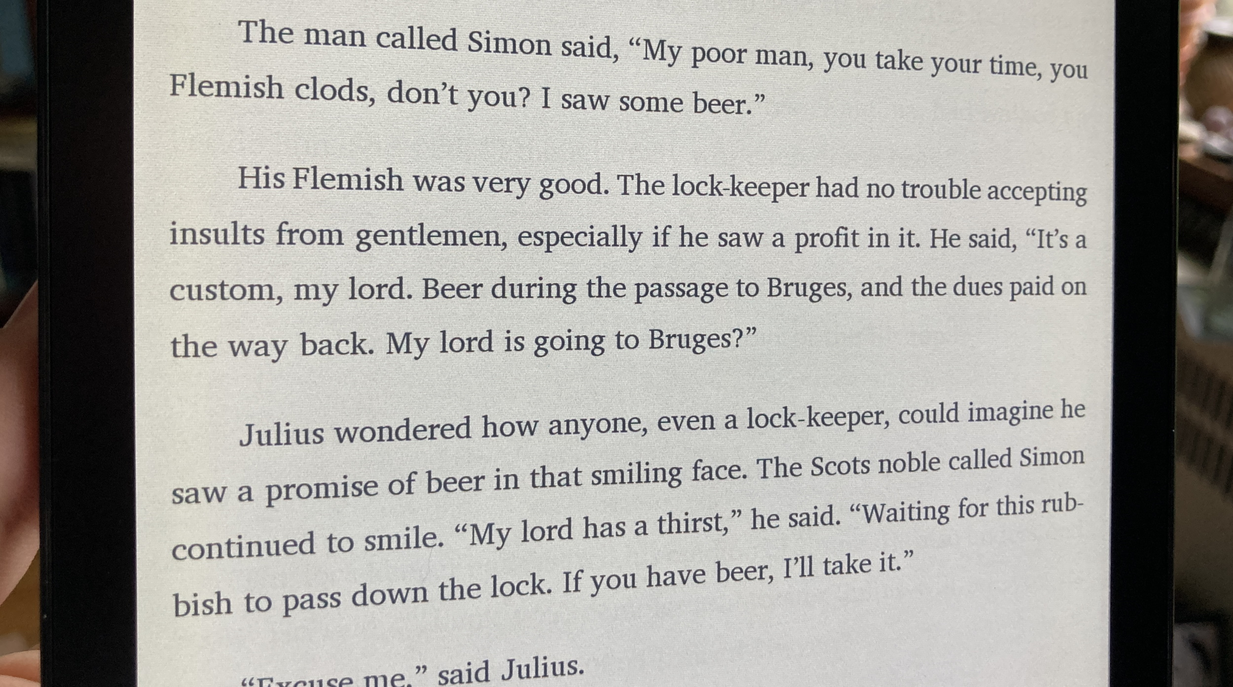
Books look all right but not nearly as clear as an ordinary monochrome E-Ink display; the screen door effect is always present and reduces contrast. It’s still very readable, but when cheaper devices do the job better, it’s hard to justify.
I appreciate Boox making the latest screen from E-Ink available, and it may be useful to some who want a little more tablet DNA in their e-reader (at this point the two categories are not very distinct). But for most people the color does not add enough, and subtracts too much.
Does it all, or stretched too thin?
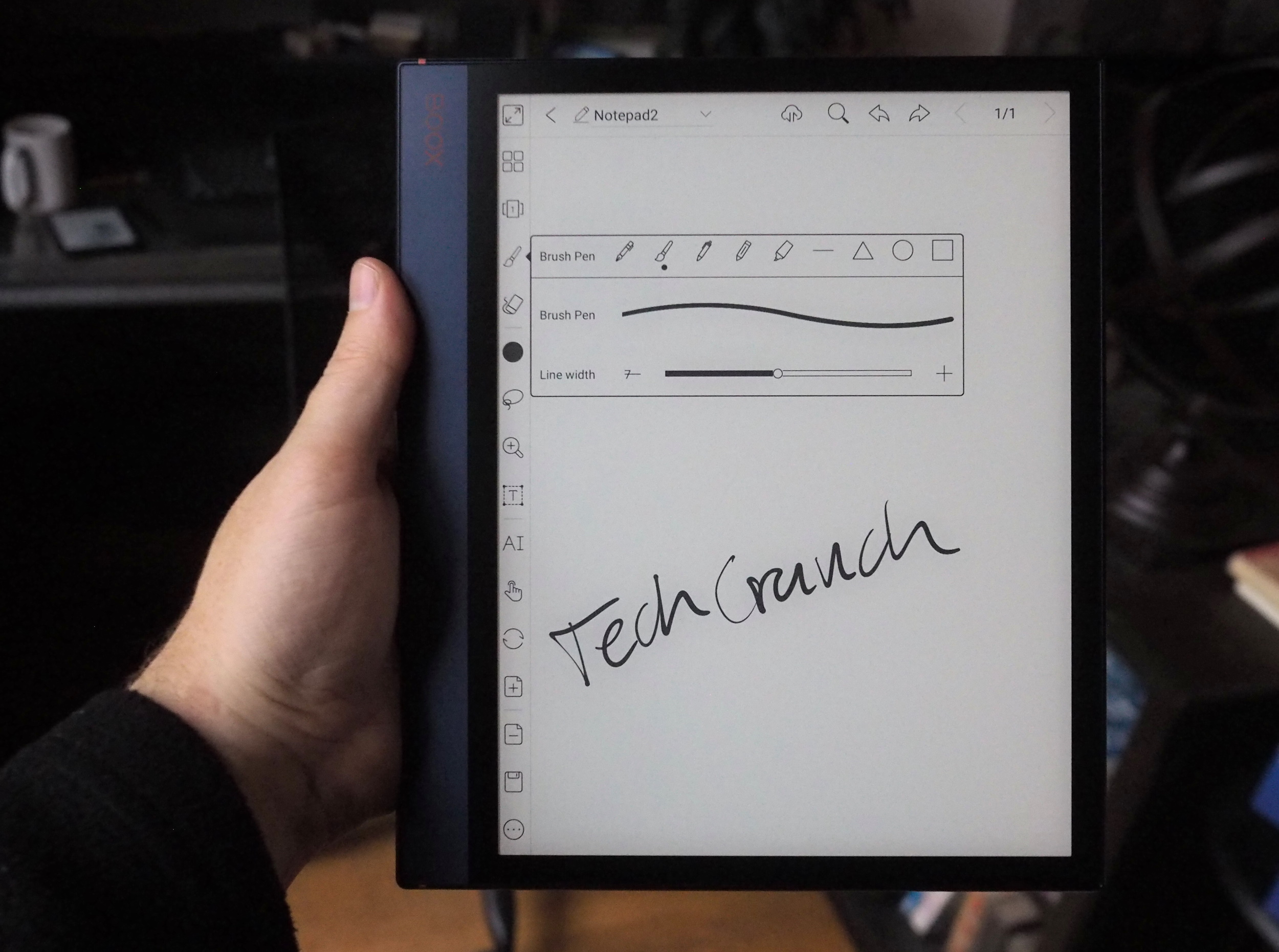
The OS is the same on all of these as far as I can tell, but on the these devices the focus shifts to interactivity rather than simply reading. Boox makes a Wacom-like pen that can be used to write on the surface of these larger tablets, and it serves its purpose fine, though with nowhere near the responsiveness or accuracy of reMarkable’s.
That said, the final result when sketching or writing was a pleasing one, though the OS takes a moment to catch up and anti-alias the marks. I thought the brush in particular had nice gradations.
One thing the Boox tablets have on others like them (that is to say, the reMarkable, the defunct Sony Digital Paper Tablet, and a handful of other niche devices) is in the PDF handling. The Boox devices let you navigate and mark up PDFs with ease, and the original files are simply saved over with your doodles and notes added. Though marking up a document is easy on the reMarkable, its slightly clumsy app makes sharing and sorting them a bit of a chore. I prefer the simple approach: modify the original file (there’s always a copy somewhere) and email it directly from the device. It’s that simple!
Besides the reader and notebook, there are a handful of included apps that any tablet user might find useful. There’s a browser that’s about as functional as you’d expect — it’s Chromium-based and renders well but ghosts terribly; a voice recorder, a music player, a calendar… and of course you could download plenty more from the built-in or Google app stores. If you wanted to, you could make these quite well-rounded devices.
I’m not entirely sure just how large the market is for this kind of e-paper tablet. But I feel these devices offer something interesting and unique, even if they’re also… well, it’s hard to get around the fact that you can get an iPad for half the price of the larger Boox tablets, and then do most of the same stuff and more.
These e-paper devices have a certain draw, though, and if you plan to read and mark up long documents, it’s way better to do so on one of these than on an iPad, for a number of reasons. With Boox’s lineup in the mix there are more options than ever, and that’s definitely a good thing.
from TechCrunch https://ift.tt/3sOdCRU

0 comments:
Post a Comment