For years when someone asked me what e-reader to buy, I’d say unless they care about Amazon stuff, the Kobo Clara HD. That recommendation has wavered as I’ve tested the compact Poke 3 and ergonomic Libra 2, but the new version of the Clara puts it back in the running for easiest to endorse.
If you’re looking for big changes, look elsewhere: The Clara 2E is a lot like the Clara of old but with a few notable updates.
First, there’s an improved screen — it isn’t night and day, but the improvements over the last few years are noticeable, with darker and sharper text and lighter backgrounds (or the inverse in dark mode). You may not notice unless you put them side by side, but if you did (like me) you’d agree it’s a real if not transformative upgrade. The color-adjustable lighting is pretty much the same as far as I could tell.
Second, the “E” in the name indicates Eco, as far as I can tell. This is because the back plate of each device is made from recycled plastic, making its exterior only 15% new stuff. Of course that doesn’t apply to the screen, the chips inside, etc, but it’s at least nice to know that a device you’re getting is notionally less wasteful than the alternative.

Image Credits: Devin Coldewey / TechCrunch
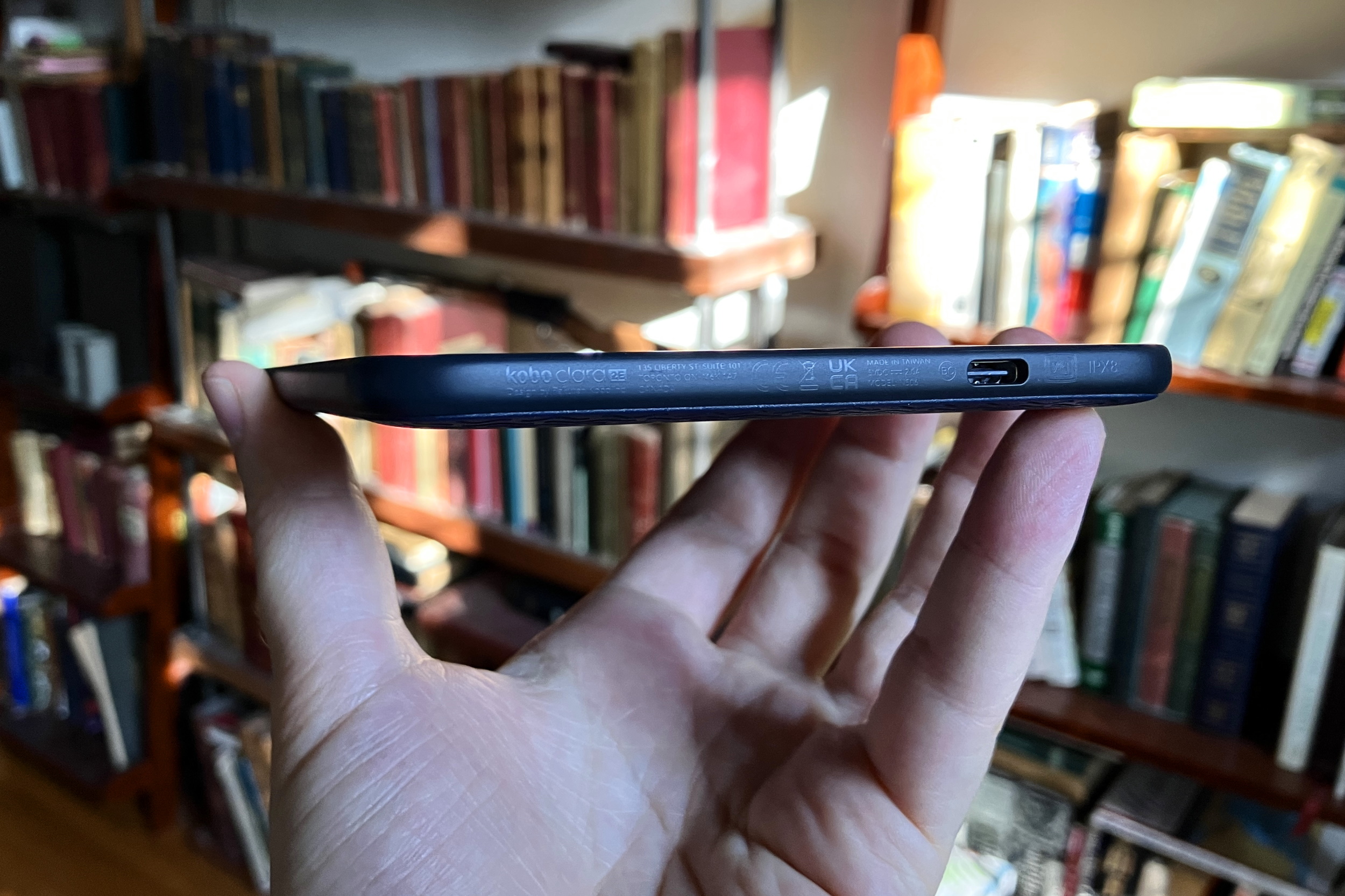
Third, though the body is almost identical to the old Clara HD — and that’s not a bad thing — they have changed the baffling bottom power button to a nice recessed one on the back. Thank god! It also uses USB-C now, which should improve charge times and maybe cut down on the number of cables you have to lug around when traveling.
Last, it’s now waterproof — as in, an hour six feet under. So don’t worry about dropping it in the pool.
Beyond these new features, it’s very similar to its predecessor. Again, though, that’s good! At $130, the Clara 2E fits neatly into the entry-level but not bargain-bin level of device where you get the most important parts of more expensive readers (300 DPI screen, temperature-adjustable light) but skip the unnecessary luxuries.
A larger screen can be both a blessing and a curse, and I’ve found that jotting notes on any screen smaller than 8″ diagonal is more trouble than it’s worth. The only feature I would add is a screen flush with the bezels, and that’s asking a lot at this price.
[gallery ids="2407872,2407869,2407867,2407868,2407866,2407871,2407870"]
As with Kobo’s other offerings, the Clara 2E supports lots of e-book and document formats from your favorite shop or free provider, built-in Overdrive and Pocket for library books and articles respectively, as well as audiobooks — still only from Kobo’s store, alas.
I’ve also found over the last year that there’s a robust Kobo-hacking community putting together really solid alternative interfaces, if you like tweaking stuff or don’t fancy the official UI (Koreader, Plato and NickelMenu are all worth trying out). Plus you can drag-and-drop new fonts in — I’ve added loads.
The Clara 2E comes with its own version of the brilliant sleep cover that made the Libra 2 for me — here’s that review:
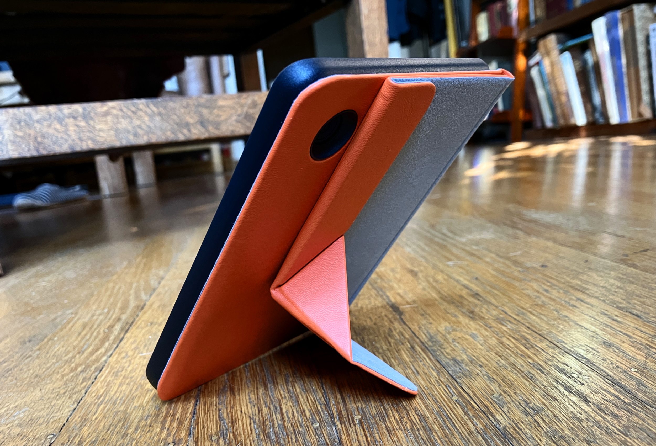
The sleep cover is a plastic protective case with a soft leather-esque sheath and magnets that tell the reader to sleep or wake when you close or open it. But more importantly, it folds up into a little kickstand, propping up the device at a readable angle.

Image Credits: Devin Coldewey / TechCrunch
It works a treat, though it isn’t quite as pleasant a grip as the Libra 2’s when you use it as a handle. It will also fold flat like a normal case if you prefer that.
Comparing this reader to Kobo’s other options, for me there’s no competition — the Clara 2E is the best deal by a long mile. On the other hand, the Libra 2 adds buttons and a bit more screen space with a very comfortable asymmetric style, though whether it’s worth the jump to $180 only you can say. The Sage felt too big for regular reading, and the Nia compromises on-screen quality, which is really the most important thing.
In Kindle world, the Paperwhite costs $160 (if you don’t want lock-screen ads — ugh) and doesn’t offer any real improvements except access to the Amazon ecosystem, admittedly for some people an important piece. The new Kindle is $120 and pretty comparable hardware-wise (I haven’t compared the screens directly yet) but all other things being equal I always vote Kobo.
So for the present, my official recommendation for anyone who asks will be to get the Clara 2E with its folding sleep cover if you can spare the extra $30.
Kobo Clara 2E review: A worthy update to an solid e-reader, with an eco-conscious touch by Devin Coldewey originally published on TechCrunch
from TechCrunch https://ift.tt/oC5WkVh

0 comments:
Post a Comment